Predicting House Prices
— R, Regression, Random Forest — 3 min read
Share
So you have a house for sale or buying one? What is a fair price for it? Can we predict it correctly?
Let’s use the “House Sales in King County” data available at Kaggle to answer that question. Each row of the dataset contains information about a home sold between May 2014 and May 2015 along with the price in US dollars. Some of the other features include:
- bedrooms - number of bedrooms
- bathrooms - number of bathrooms
- floors - number of floors
- yr_built - year built
- zipcode
- long - longitude
- lat - latitude
- condition - building condition (ordered categorical variable in the range 1 - 5)
- grade - construction quality of improvements (ordered categorical variable in the range 1 - 13)
If not interested in house prices you still can learn something about regression, classification trees, and extreme gradient boosting.
Fire up R and load some libraries
1library(ggplot2)2library(reshape2)3library(plyr)4library(dplyr)5library(rpart)6library(rpart.plot)7library(caret)8library(doMC)9library(scales)10library(GGally)Load our utility functions, make results reproducible and instruct R to use all our CPU cores (my PC has 8 cores, you might want to revise that value for yours).
1source("utils.R")23set.seed(42)4theme_set(theme_minimal())5registerDoMC(cores = 8)6options(warn=-1)Load and preprocess the dataset
1df <- read.csv("data/kc_house_data.csv", stringsAsFactors = FALSE)1print(paste("rows:", nrow(df), "cols:", ncol(df)))1[1] "rows: 21613 cols: 21"Remove id and date columns and instruct R to interpret condition, view, grade and waterfront as factors.
1df <- df[-c(1, 2)]2df$condition <- as.factor(df$condition)3df$view <- as.factor(df$view)4df$grade <- as.factor(df$grade)5df$waterfront <- as.factor(df$waterfront)Exploration
Do we have missing data?
1ggplot_missing(df){:.center}
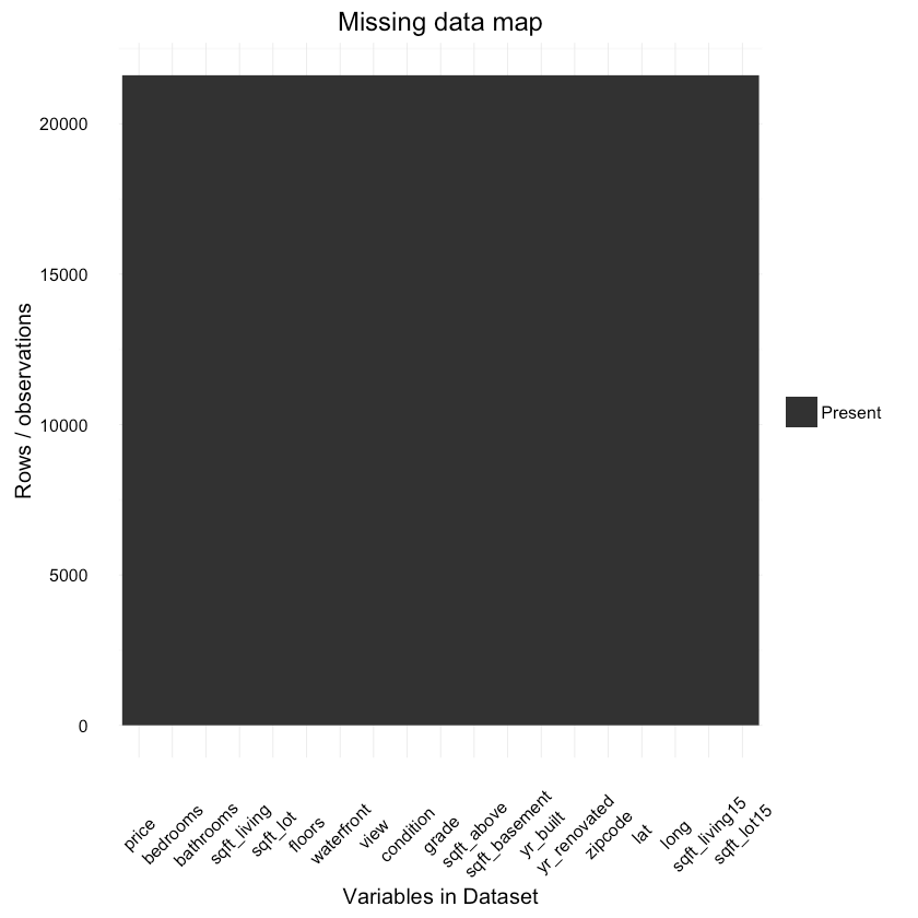
It looks like everything is in here! Great!
Maps
The following awesome maps were created by Thierry Ellena. Let’s have a look at them:
House locations
Number of houses by zipcode
Price by zipcode
Let’s look at the distribution of house condtion, grade and price:
1p1 <- qplot(condition, data=df, geom = "bar",2 main="Number of houses by condition")34p2 <- qplot(grade, data=df, geom = "bar",5 main="Number of houses by grade")67p3 <- ggplot(df, aes(price)) + geom_density() +8 scale_y_continuous(labels = comma) +9 scale_x_continuous(labels = comma, limits = c(0, 2e+06)) +10 xlab("price") +11 ggtitle("Price distribution")1213multiplot(p1, p2, p3){:.center}
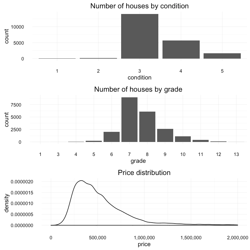
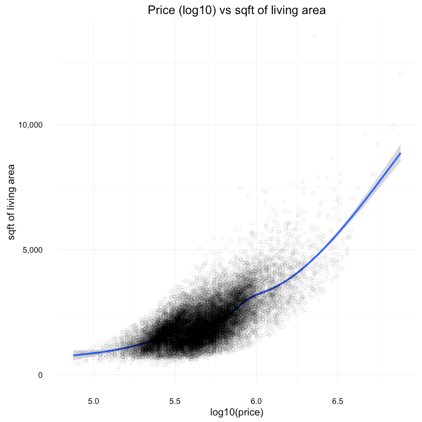
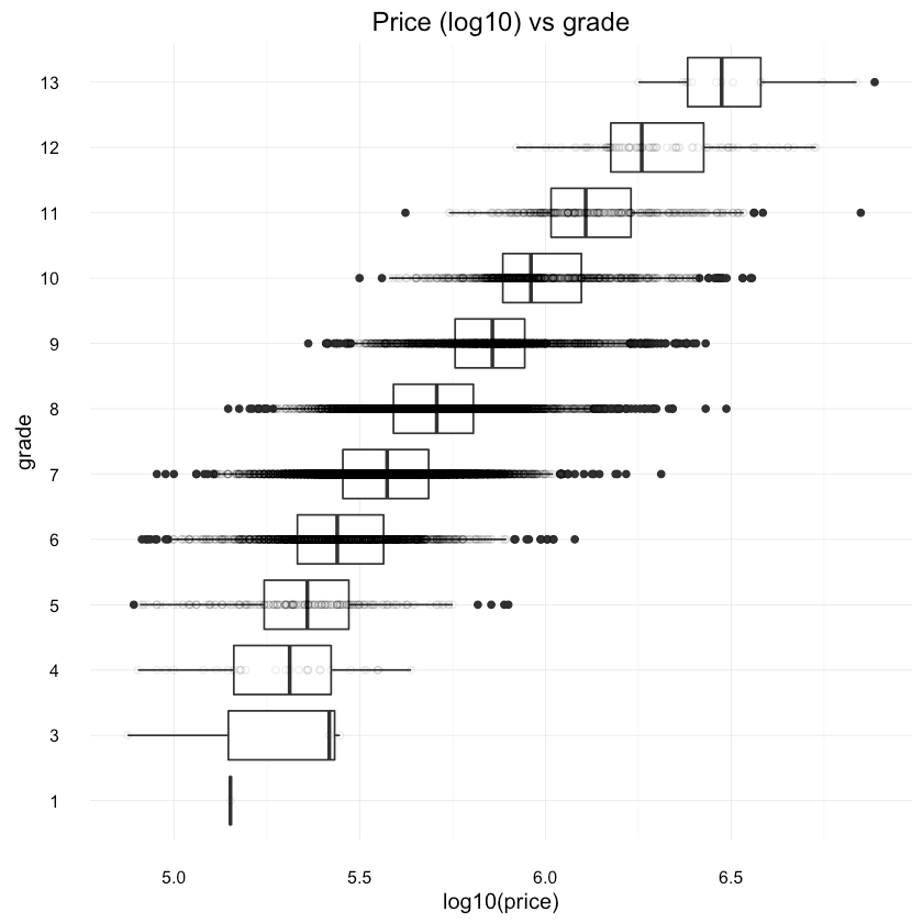
And a look at price (log10) vs other features:
1ggplot(df, aes(x=log10(price), y=sqft_living)) +2 geom_smooth() +3 scale_y_continuous(labels = comma) +4 scale_x_continuous(labels = comma) +5 ylab("sqft of living area") +6 geom_point(shape=1, alpha=1/10) +7 ggtitle("Price (log10) vs sqft of living area"){:.center}
1ggplot(df, aes(x=grade, y=log10(price))) +2 geom_boxplot() +3 scale_y_continuous(labels = comma) +4 coord_flip() +5 geom_point(shape=1, alpha=1/10) +6 ggtitle("Price (log10) vs grade"){:.center}
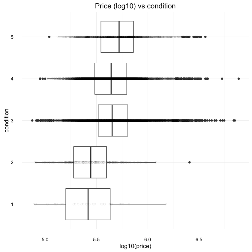
1ggplot(df, aes(x=condition, y=log10(price))) +2 geom_boxplot() +3 scale_y_continuous(labels = comma) +4 coord_flip() +5 geom_point(shape=1, alpha=1/10) +6 ggtitle("Price (log10) vs condition"){:.center}
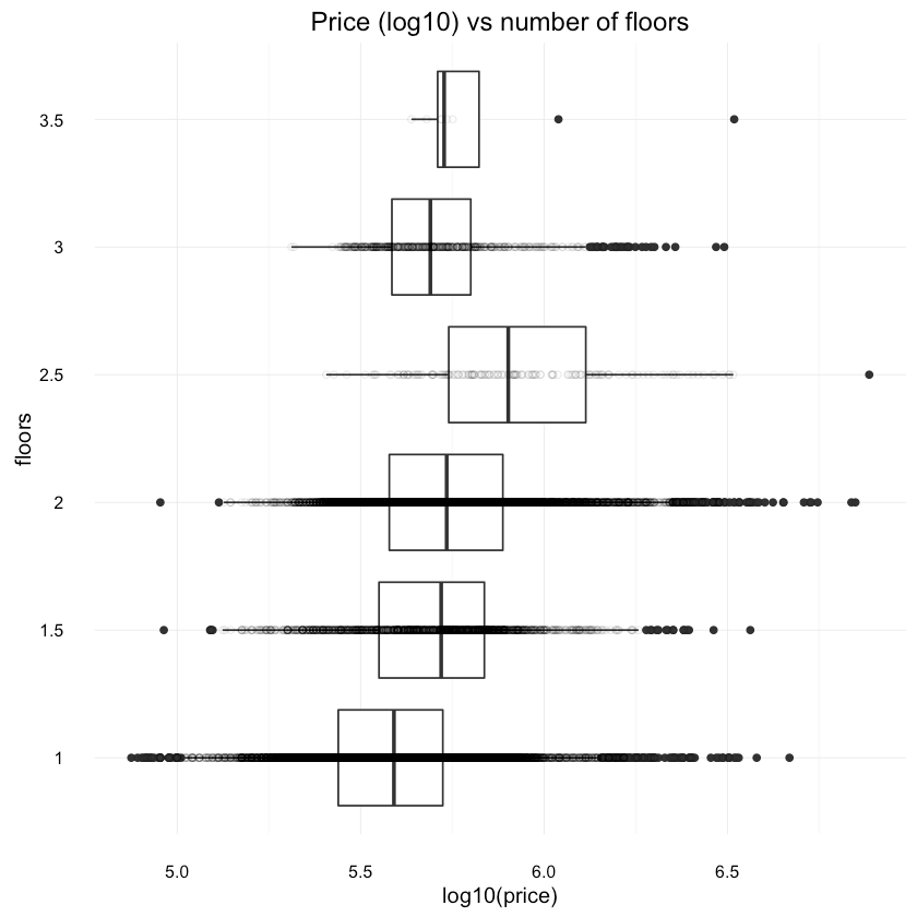
1ggplot(df, aes(x=as.factor(floors), y=log10(price))) +2 geom_boxplot() +3 scale_y_continuous(labels = comma) +4 xlab("floors") +5 coord_flip() +6 geom_point(shape=1, alpha=1/10) +7 ggtitle("Price (log10) vs number of floors"){:.center}
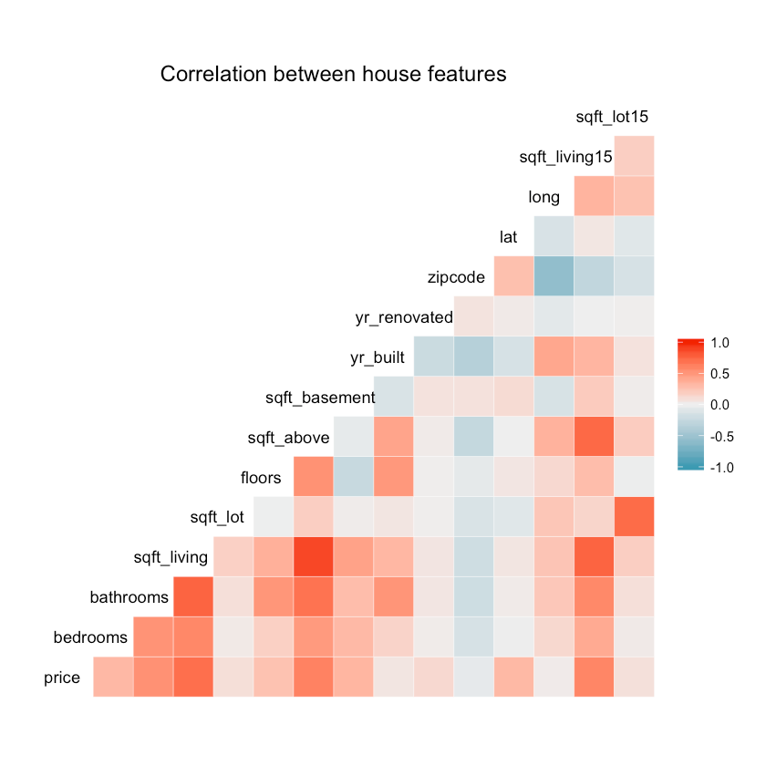
How different features correlate?
1ggcorr(df, hjust = 0.8, layout.exp = 1) +2 ggtitle("Correlation between house features"){:.center}
Splitting the data
We will split the data using the caret package. 90% will be used for training and 10% for testing.
1train_idx = createDataPartition(df$price, p=.9, list=FALSE)23train <- df[train_idx, ]4test <- df[-train_idx, ]We will extract the labels (true values) from our test dataset.
1test_labels <- test[, 1]First attempt of building a model
Let’s build a decision tree with the rpart package using all features (except price) as predictors:
1tree_fit <- rpart(price ~ ., data=df)2tree_predicted <- predict(tree_fit, test)And the results of our model:
1summary(tree_predicted)1Min. 1st Qu. Median Mean 3rd Qu. Max.2 315400 315400 462800 542000 654900 50810001summary(test_labels)1Min. 1st Qu. Median Mean 3rd Qu. Max.2 82000 322100 450000 536300 643900 34190001cor(tree_predicted, test_labels)0.814574873081786
1rmse(tree_predicted, test_labels)197634.31260839
How the actual and predicted distributions compare to each other?
1res <- data.frame(price=c(tree_predicted, test_labels),2 type=c(replicate(length(tree_predicted), "predicted"),3 replicate(length(test_labels), "actual")))45ggplot(res, aes(x=price, colour=type)) +6 scale_x_continuous(labels = comma, limits = c(0, 2e+06)) +7 scale_y_continuous(labels = comma) +8 geom_density(){:.center}
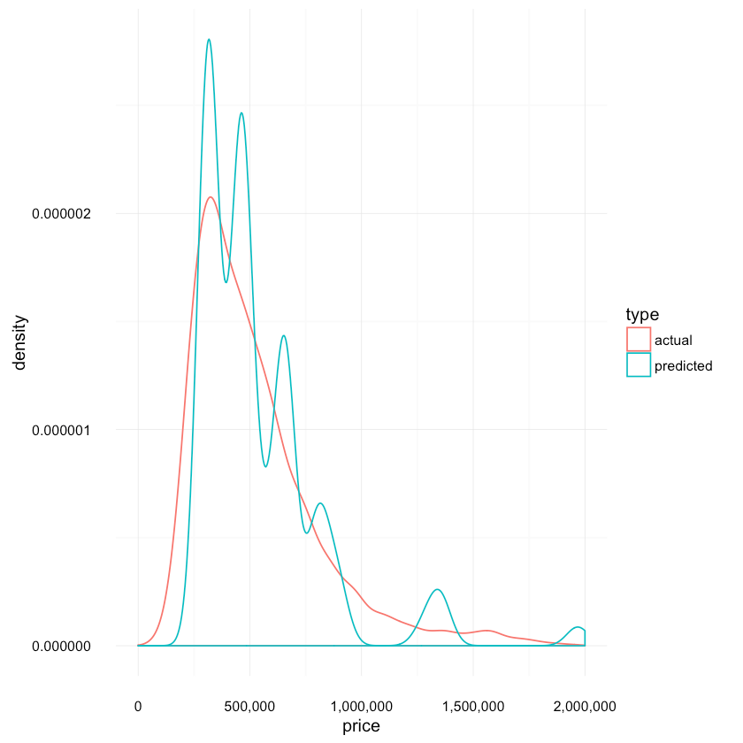
Not very good, eh? Let’s dig a bit deeper.
How does our model looks like?
1rpart.plot(tree_fit, digits = 4, fallen.leaves = TRUE,2 type = 3, extra = 101){:.center}
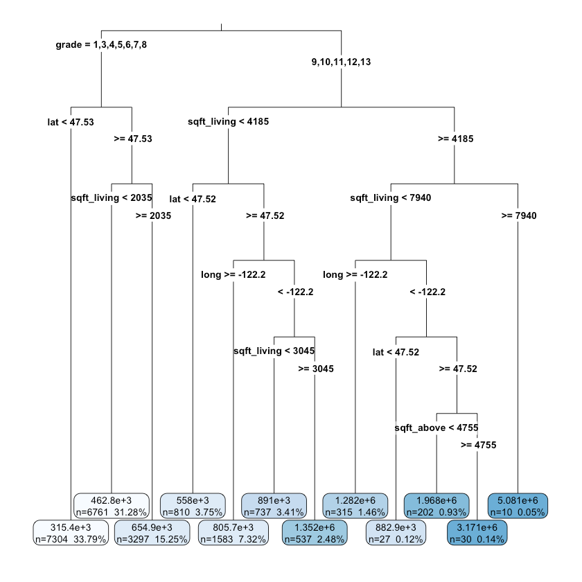
It seems that the grade, location (lat, long), square feet are important factors for deciding the price of a house.
Fitting a xgbTree model
That was a good first attempt. Ok, it wasn’t even good. So, can we do better? Let’s try an ensemble of boosted trees. For good intro to boosted trees see: Introduction to Boosted Trees.
First, we will set up the resampling method used by caret. 10 cross-validation passes should do (preferably in parallel).
1ctrl = trainControl(method="cv", number=10, allowParallel = TRUE)Our next step is to find good parameters for XGBoost. See the references below to find out how to tune the parameters for your particular problem. Those are the parameters I’ve tried:
1param_grid <- expand.grid(eta = c(0.3, 0.5, 0.8),2 max_depth = c(4:10),3 gamma = c(0),4 colsample_bytree = c(0.5, 0.6, 0.7),5 nrounds = c(120, 140, 150, 170),6 min_child_weight = c(1))After trying them out, the following were chosen:
1param_grid <- expand.grid(eta=c(0.3),2 max_depth= c(6),3 gamma = c(0),4 colsample_bytree = c(0.6),5 nrounds = c(120),6 min_child_weight = c(1))Finally, time to train our model using root mean squared error as score metric:
1xgb_fit = train(price ~ .,2 data=df, method="xgbTree", metric="RMSE",3 trControl=ctrl, subset = train_idx, tuneGrid=param_grid)45xgb_predicted = predict(xgb_fit, test, "raw")and the results:
1summary(xgb_predicted)1Min. 1st Qu. Median Mean 3rd Qu. Max.2 143100 323700 464700 542100 649700 60760001summary(test_labels)1Min. 1st Qu. Median Mean 3rd Qu. Max.2 82000 322100 450000 536300 643900 34190001cor(xgb_predicted, test_labels)0.926845603997267
1rmse(xgb_predicted, test_labels)132324.026367212
comparison of actual and predicted distributions:
1res <- data.frame(price=c(xgb_predicted, test_labels),2 type=c(replicate(length(xgb_predicted), "predicted"),3 replicate(length(test_labels), "actual")))45ggplot(res, aes(x=price, colour=type)) +6 scale_x_continuous(labels = comma, limits = c(0, 2e+06)) +7 scale_y_continuous(labels = comma) +8 geom_density(){:.center}
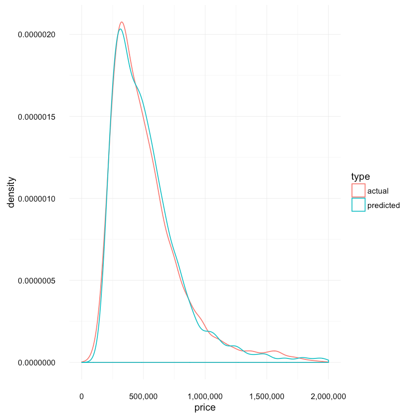
The distributions look much more similar compared to the one produced by the decision tree model.
What are the most important features according to our model?
1imp <- varImp(xgb_fit, scale = FALSE)23imp_names = rev(rownames(imp$importance))4imp_vals = rev(imp$importance[, 1])56var_importance <- data_frame(variable=imp_names,7 importance=imp_vals)8var_importance <- arrange(var_importance, importance)9var_importance$variable <- factor(var_importance$variable,10 levels=var_importance$variable)1112var_importance_top_15 = var_importance[with(var_importance,13 order(-importance)), ][1:15, ]1415ggplot(var_importance_top_15, aes(x=variable, weight=importance)) +16 geom_bar(position="dodge") + ggtitle("Feature Importance (Top 15)") +17 coord_flip() + xlab("House Attribute") + ylab("Feature Importance") +18 theme(legend.position="none"){:.center}
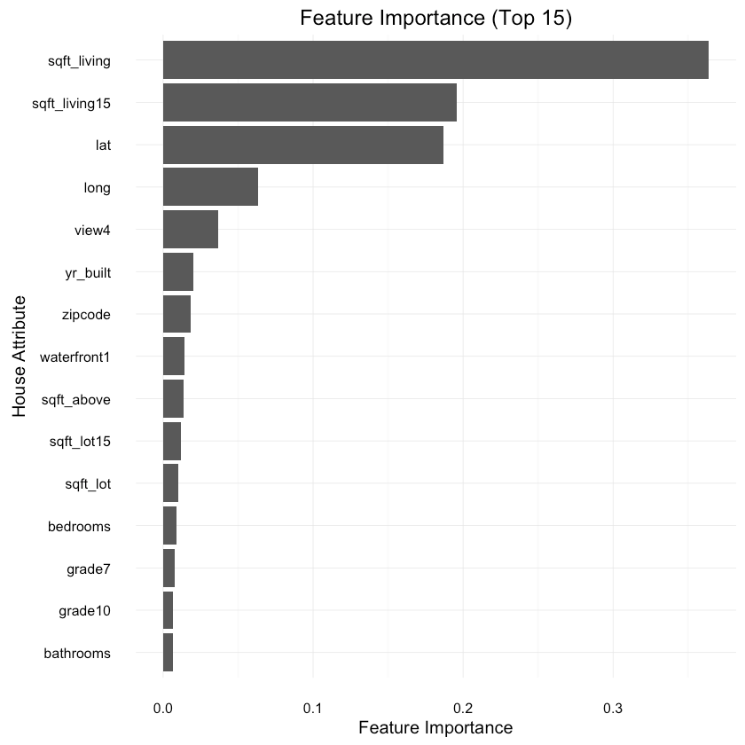
Compare distributions of predictions
Let’s see how the tree distributions compare to each other:
1res <- data.frame(price=c(tree_predicted, xgb_predicted, test_labels),2 type=c(replicate(length(tree_predicted), "tree"),3 replicate(length(xgb_predicted), "xgb"),4 replicate(length(test_labels), "actual")5 ))67ggplot(res, aes(x=price, colour=type)) +8 scale_x_continuous(labels = comma, limits = c(0,2e+06)) +9 scale_y_continuous(labels = comma) +10 geom_density(){:.center}
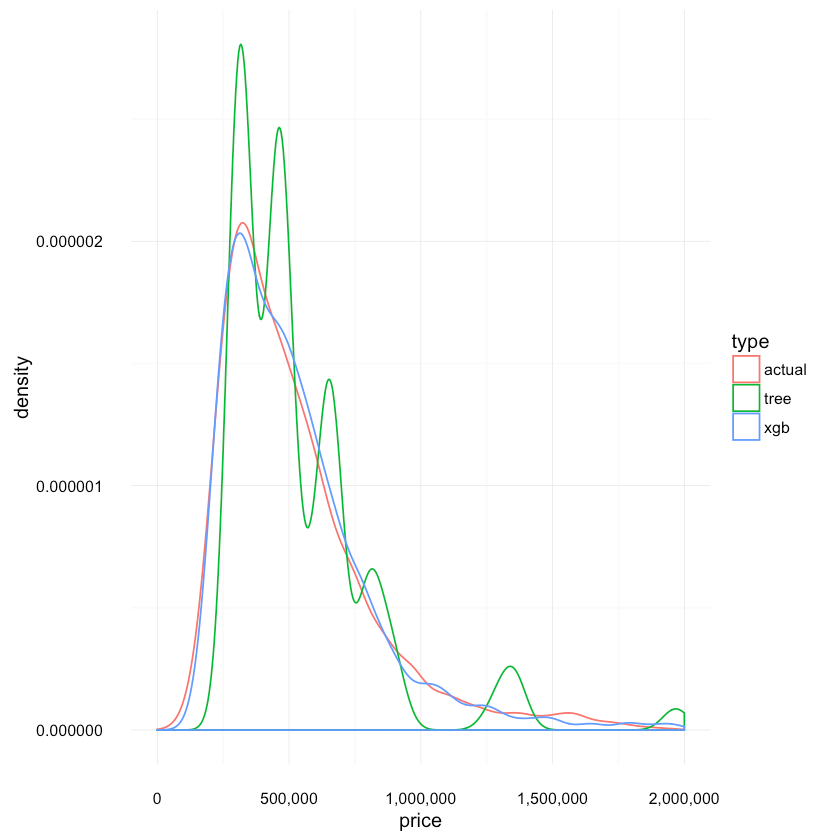
Again, we can confirm that the Boosted Trees model provides much more accurate distribution with its predictions.
How well we did, really?
Let’s randomly choose 10 rows and look at the difference between predicted and actual price:
1test_sample <- sample_n(test, 10, replace=FALSE)2test_predictions <- predict(xgb_fit, test_sample, "raw")3actual_prices <- round(test_sample$price, 0)4predicted_prices <- round(test_predictions, 0)5data.frame(actual=actual_prices,6 predicted=predicted_prices,7 difference=actual_prices-predicted_prices)| actual | predicted | difference |
|---|---|---|
| 680000 | 566726 | 113274 |
| 1400000 | 1502961 | -102961 |
| 400000 | 465854 | -65854 |
| 468000 | 382870 | 85130 |
| 220000 | 208510 | 11490 |
| 525000 | 553434 | -28434 |
| 404000 | 559599 | -155599 |
| 327000 | 316226 | 10774 |
| 475000 | 460288 | 14712 |
| 443000 | 431310 | 11690 |
Is this good? Well, personally I expected more. However, there are certainly more things to try if you are up to it. One interesting question that arises after receiving prediction is: How sure the model is that the price is what he tells us it is? But that is a topic for another post.
References
RMSE explained
Gradient Boosting explained
Dataset attributes explained
More information for the attributes
XGBoost
Introduction to XGBoost
Optimizing XGBoost
Parameter tuning in XGBoost
caret
Share
Want to be a Machine Learning expert?
You'll never get spam from me